MENU
CLOSE


Higher Ed Consulting
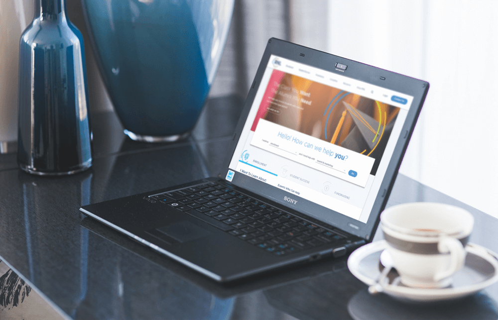

Ruffalo Noel Levitz (RNL) is a leading higher education consultant that helps colleges, universities, and nonprofits across the entire student lifecycle. They offer services and solutions to get more students to enroll, guide them through the college experience, and assist in fundraising post-graduation.
With three distinct verticals that needed equal representation on their website, I led my team to re-envision their navigation and visual style. To do this, we talked with stakeholders, collected analytical and user data, and analyzed personas to guide the designs.
The resulting product is modern, easy to navigate, and focuses on how RNL can help “you.”
Bart Heird
Creative Director
Justin Kalaskey
Jess Haines
Walt Irby
Sarah Breitschwerdt
Sr UX/UI Designer
Jr UX Designer
Sr Developer
Project Manager
Team Lead
Design
Branding
Research
IA
Wireframes
Interviews
Ooh, Aah!
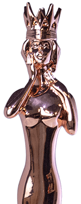
Muse Creative Awards (2019) - Rose Gold
dotCOMM Awards (2019) - Gold
Over the course of a month, myself and my Jr UX Designer collaborated in gathering all the necessary discovery documents from RNL, reviewing them, and building our game plan for additional research.
RNL’s team was able to provide us with personas they had created previously to give us insight into who in a college/university would be using and/or buying RNL’s services. On top of this, we performed interviews with stakeholders and some current customers to gain insight into how RNL is helping them.
We learned some critical information that helped to drive the strategy for the redesigned website.
The biggest issue we identified is that users had difficulty finding information relevant to different aspects of the student lifecycle (Enrollment, Student Success, and Fundraising). In higher ed institutions, these verticals are separate from each other and rarely overlap.
While RNL already has a long sales cycle, their website wasn’t helping to convince colleges/universities that they should trust RNL’s products. Much of the content on the website was either hidden or was written in long paragraphs with difficult-to-scan content, placing an unnecessary burden on the sales team to build trust further.
Overall, the website was filled with large, cluttered photos that lacked focus, dark brand colors were used in full bleeds, and white space was rare. Paired with a lot of content, it was a recipe for high bounce rates and low session durations.

The site's treasure map

After I interviewed both stakeholders and customers, it was clear that RNL’s users would only look within their respective verticals, based on their department--not moving horizontally into other verticals.
With this knowledge in-hand, I led the team to build the navigation structure of the product so users could focus on their own vertical without needing to see irrelevant information within their journeys.
Hint Text: Click the Figma logo to see the other pages, including mockups. Or don't, I'm not your real dad.


In order to help users be able to find relevant information quickly, I created a color-coding system by assigning each vertical a color: enrollment is light blue, student success is orange, and green is fundraising. Because each persona will remain in their respective vertical, they will build up a visual match with that color across the site.
In the resource and team member libraries, we were able to take advantage of this color system. By adding a color bar to the bottom of content cards, people can quickly glance for their respective color and know that resource/team members will align with their needs.
This helpful indicator was able to drive a 23% increase in content downloads (e.g. case studies), helping users build trust more quickly in RNL.
One month post-launch compared to the previous month
+17%
increase in organic traffic
+36%
increase in conversion rate
+23%
increase in content downloads

“I feel like we've gone from a Model T to a Tesla.”
Brandon Trissler
Associate Vice President, RNL
Said by someone more important than me