MENU
CLOSE


Digital Marketing Agency

WebMechanix (WMX) is a growing, full-stack digital marketing agency that helps clients with SEO, paid advertising, and conversion rate optimization, among many other marketing-related services. After being in business for 10 years (six of which I was a part of), I kickstarted the initiative to rebrand the company for the next decade and beyond.
I led the project discovery at the start to ensure the new brand aligns with the company direction and helped users see why they should partner with WMX. I did this by consulting with various stakeholders and customers to extract out information on how they perceive the company, including the culture, voice, and offerings. It resulted in a brand that’s energetic, flexible, and cohesive. Its industrial characteristics are a slight play on the company name and the amount of work that employees do behind-the-scenes.
Bart Heird
Creative Director
Justin Kalaskey
Abbey Schuyler
Dennis Zechman
Associate Director, UX
Sr Digital Designer
Sr Digital Designer
Mike Kroptavich
Jess Lovett
Elina Rapoport
Walt Irby
Digital Designer
UX Designer
UX Designer
Development
Team Lead
Design
Branding
Research
Wireframes
Interviews
When this project began, we knew we had problems with the website, especially with it being several years old and built without intention. What we didn’t realize is just how many problems we were faced with until we started speaking to internal stakeholders (C-suite, sales, and marketing), current customers, and sales prospects.
In addition to interviews, I led internal workshops to build personas, organizational goals, and identify how we can improve the WebMechanix brand. I also worked with our internal marketing team to review our Google Analytics and Hotjar data to see what users were actually doing on the website.
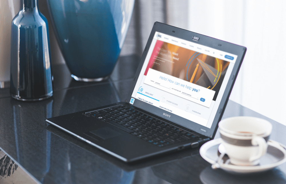
WMX’s website was its top sales tool in helping to convince CMOs and Directors of Marketing that we should be considered as an agency partner. But with jargon-filled content that didn’t say anything, these users were getting confused and usually ended up leaving.
One of the biggest findings was the frustration that users faced when confronted with a form, especially as they’re trying to vet WMX’s experience. While collecting emails was important to WMX, users saw it as a hindrance, preventing them from seeing the successes WMX had with other clients.
The overall WMX brand hadn’t experienced a solid redesign in nearly a decade and it showed. The brand was ruled by dark, masculine colors, poor iconography, and trends that had died out years prior.

There are two primary audiences coming to the WebMechanix website: Decision-makers looking to hire WMX and Career Seekers. For this iteration of the refresh and the upcoming larger redesign, we focused on the former audience, made up of CMOs and/or their second-in-commands.
I spoke with eight recent clients and prospects to gain a better understanding of their research process and impressions of the website. This information, combined with expert knowledge from internal stakeholders, helped us to create archetypes and paved the way for a better website experience.
Archetypes > Personas.
Ask me why.


One of the internal stakeholder workshops I led was a session to gain a better understanding of the WMX brand and what it should represent. Using the insights we uncovered, I sent out a survey to all employees to see how their views matched up. The results were fairly well aligned with our findings, helping to solidify our branding direction.
Over the course of several months, myself and the entire creative team collaborated to elaborate on our colors, typography, iconography, and writing voice.
The outcome was a brand evolution that still retained some of the WMX feeling while promoting trust through brighter colors, personable typography, and a custom illustrative style that felt uniquely us.

Industry is a bold squared geometric sans with a high x-height for clear legibility. Its square features feel mechanical and ready tackle the toughest jobs.

Proxima Nova is a contemporary sans serif with lightly geometric features. This allows it retain a high legibility at smaller sizes and balances well against Industry.

+2
new design-only client retainers
+43%
increase in conversions
23
pages rewritten for clarity and brevity