Healthcare SaaS

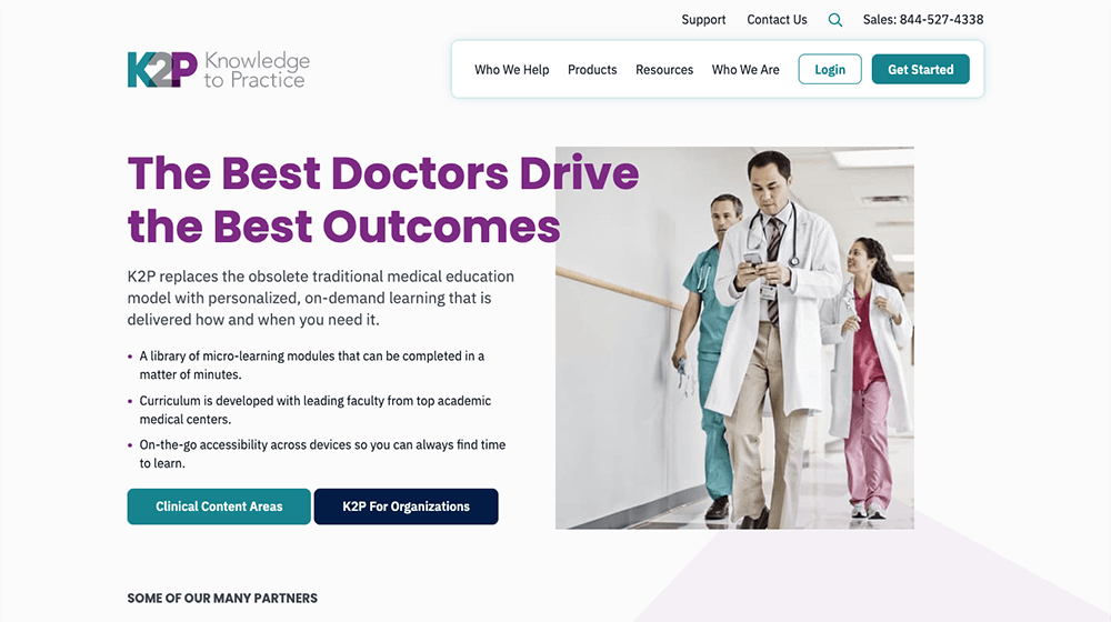
Knowledge To Practice (K2P), a continuing medical education software provider, came to WebMechanix in need of a redesign. K2P’s software ranges from helping physicians pass their board exams to keeping up with the latest journal articles within their field.
Using data provided by K2P’s team, stakeholder interviews, analytics, and heatmaps, we created user personas with matching journeys. This allowed us to focus on the user flow of the website and make navigation as frictionless as possible. We used this data to create a new IA structure—vetted in live user testing—that allows users to segment themselves, making relevant information effortless to find.
Justin Kalaskey
Sr UX/UI Designer
Bart Heird
Jess Lovett
Walt Irby
Derek Cavalero
Josh Waldman
Eric Znamirowski
Creative Director
Jr UX Designer
Sr Developer
Director, Development
Copywriter
Project Manager
Usability Testing
Team Lead
Design
Branding
Research
IA
Wireframes
Interviews

Ooh, Aah!
Muse Creative Awards (2020) - Gold
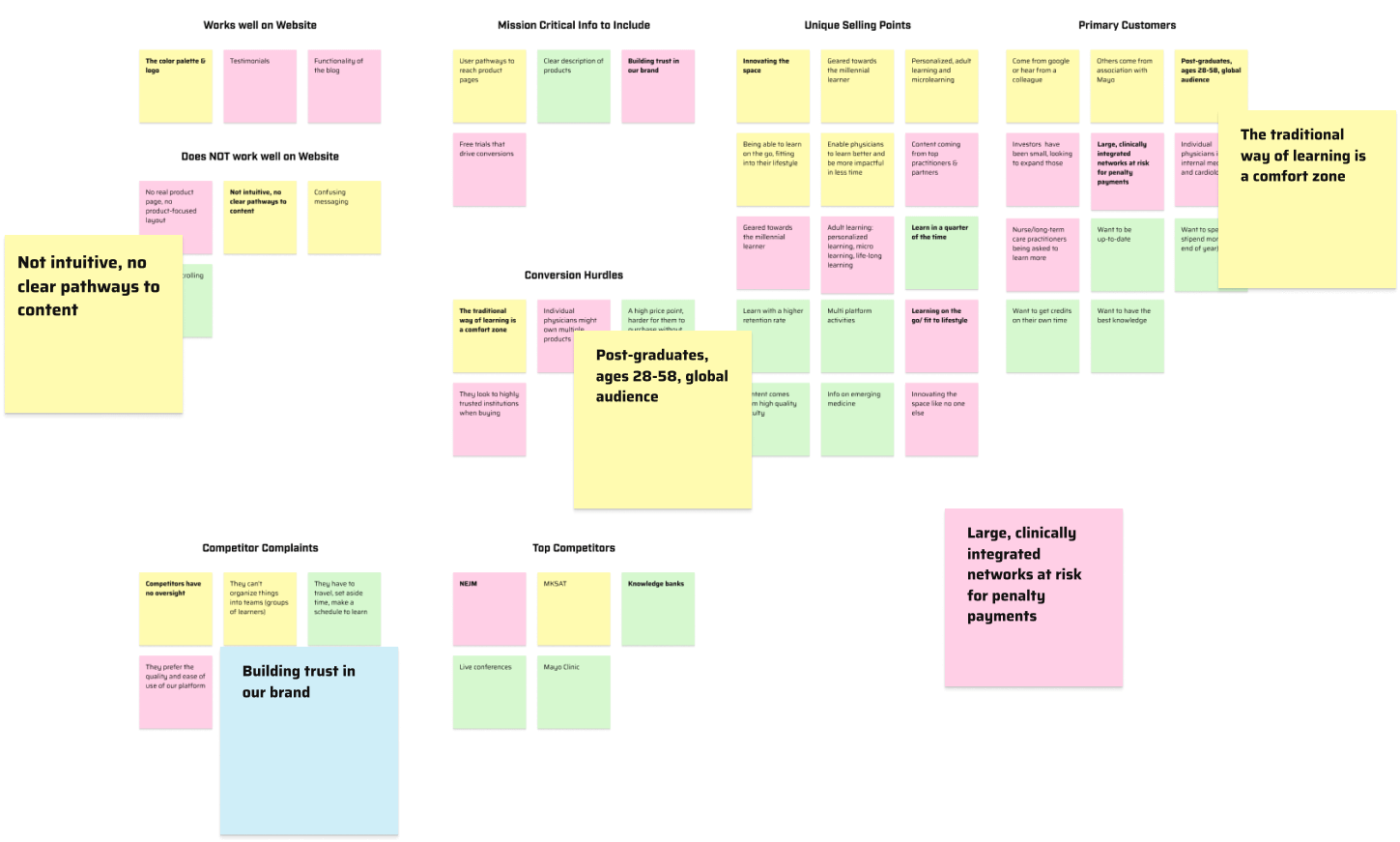
When we first began, K2P provided us with many insights about their audience they had researched themselves, however the research was scattered and incomplete. After I had sorted through to find all relevant information, I led the team in conducting additional stakeholder and user interviews to fill in gaps and uncover extra pain points the users faced.
Included in this discovery was a review of their Google Analytics, Hotjar heatmaps and recordings, and secondary research.
With all this information in-hand, we put together our goals and strategies for the rebuild of K2P’s website—their primary sales tool.
K2P’s primary audience prior to this project were individual doctors looking to pass their board exams and stay at the top of their game. But they were looking to expand into hospital systems and healthcare networks to embed their software into the organization’s physician training programs.
With various products for multiple specialties and levels of learning, K2P’s product identification was confusing at best and off-putting at worst. Users couldn’t easily segment themselves and then correctly identify which product they actually needed, causing low conversions and high bounce rates.
We uncovered that most of the content in K2P’s products were written by experts at Mayo Clinic, but K2P wanted to rewrite everything themselves. By dropping the Mayo name, they were opening themselves up to a lack of trust in the community, something that could easily impact their reputation and bottom line.
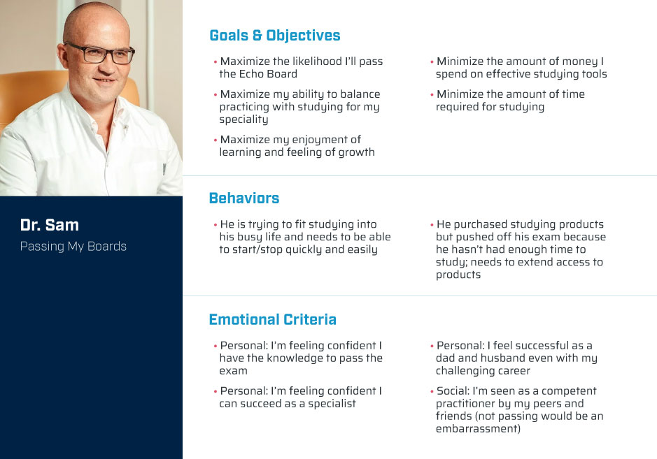
K2P’s new website needed to be built for two primary audiences:
The success of the website depended on being able to appeal to both audiences without users getting confused.
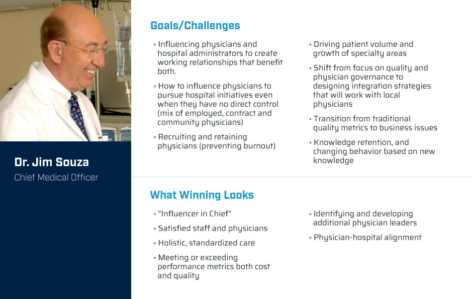
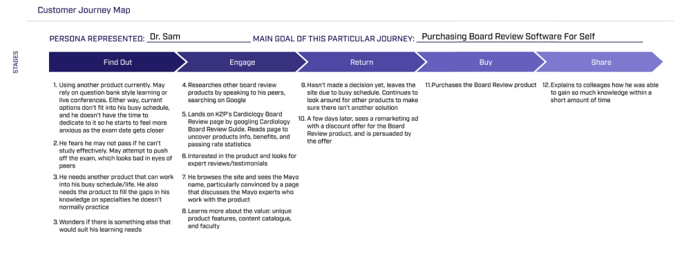
To accomplish this, I needed to understand their 10 broad marketing personas and create their journeys: 3 B2C and 7 B2B. I did this through using the research provided by K2P, secondary research, and analytical data from GA and Hotjar.
Under the B2B umbrella lived a variety of stakeholders who would play an integral role in the very large purchase of K2P’s software, such as:
Each journey was unique in that any of them could seek out K2P’s software so we had to ensure K2P’s website was flexible and intuitive enough to account for each situation.

The site's treasure map
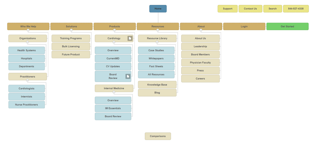
Based on user testing, the best way we found to group information was by archetype, not product. Because users had trouble identifying which product was best for them, we had to help them understand how K2P can help them first. Then, by clearly differentiating the information between organizations and practitioners, we created an easy user flow to help them find relevant information quickly.
The rest of the navigation offers people to learn about K2P’s products and solutions, after they’ve already learned what would be best for them.
Hint Text: Click the Figma logo to see the other pages, including mockups. Or don't, I'm not your real dad.
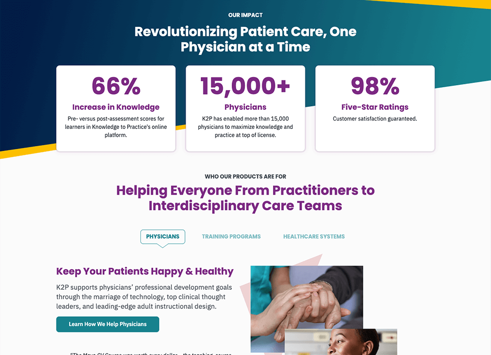
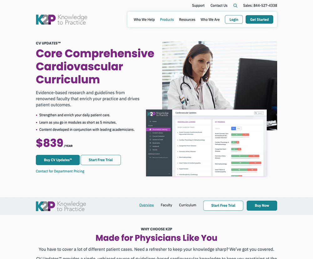

While creating wireframe prototypes for the website, we wanted to ensure the new navigation and page layouts were intuitive for their audience: doctors who had very little experience using the web.
I made an interactive prototype (shown above) in Figma and performed live user testing with some current customers. With their help, we edited the IA verbiage and reformatted a few content components to make the site more doctor-friendly and, thus, easier to read.

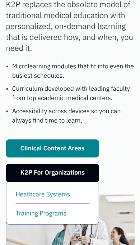

One month post-launch compared to the previous month
+258%
increase in conversion rate
-46%
decrease in bounce rate
+285%
increase in revenue/user
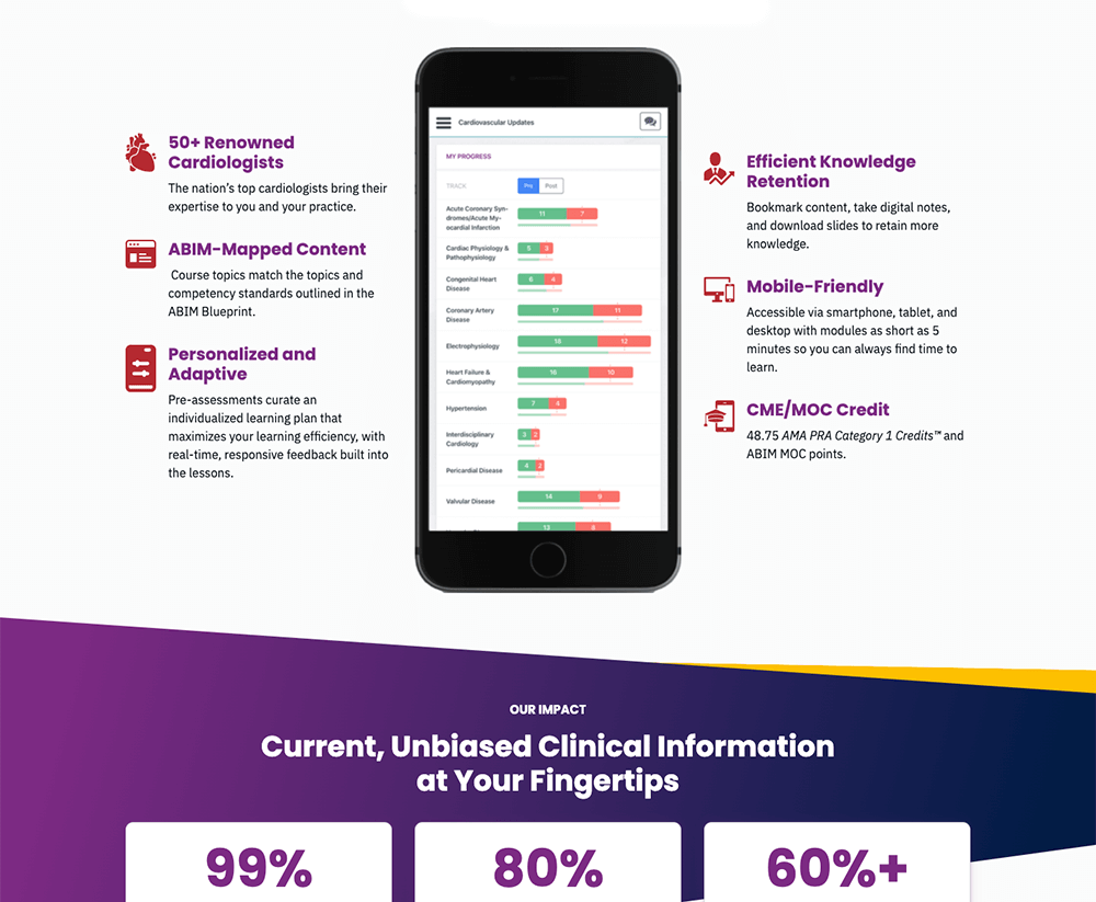
“The time that went into understanding our customers led to a design that clearly meets the customer’s needs.”
Edward “EJ” White
Director of Digital Marketing, K2P
Said by someone more important than me