For three and a half weeks in 202X, I strategized and designed a 0-1, emerging tech-integrated feature that was built into a Mastercard product. I really, really, really want to tell you about it, but it’s confidential until its public release (TBD). To stay within NDA compliance, the remainder of this story will talk about the project at a high level.

Driving a 557% login spike with a first-of-its-kind Mastercard feature in 3.5 weeks

a super secret Mastercard project…
My role
- UX strategy
- Research
- Competitor analysis
- Product design
- Interaction design
- Rapid prototyping
Timeline
Team
- Ana Cosma - Product Manager
- Annie Stone - Director, Marketing Services
- Scott Hockett - Data Strategist
- Michael Kochendorfer - Senior Software Architect
Tools

context
I was summoned to build a 0-1, emerging tech-integrated MVP feature for a Mastercard product that would be highly integrated with the product’s content to provide an innovative, personalized experience for their users.
Oh, and they needed a high-fidelity, Figma prototype ready to go within three weeks after kickoff… while working on it for only 20 hrs/wk, per the contract.



impact
A new, high-quality product, built with emerging technology, allowing Mastercard to remain a leader in the market and staying one step ahead of its competitors.
It was delivered on-time and on-budget, and received heaps of praise from Mastercard’s senior leadership.

Within 24 hours of Internal, global release
1,044
unique users
3,421
times used
557%
increase in logins compared to average daily peak
Within q1 2024
2,586
unique users
13,112
times used
[xx]
insert more impressive stats here, but can’t because, you know, NDA

I received all the time i needed
[narrator: he didn't]
Other groups within Mastercard were working with similar emerging technologies, all vying to be the first to put out a product or feature with this tech enabled. As fortune had it, the feature I was about to work on was the one to get the green light, so all eyes were on my designs. So what did that mean?
This project was a priority for Mastercard’s leadership team, and it needed to be functional quickly. Period.
A very strict, deadline-driven feature release meant that all of my research, strategy, and product design needed to happen nearly simultaneously.
Or, in other words, I was lining up to run the 100m sprint at the Product Design Olympics.
on your mark, get set, go!

strategic foundation and user insights
(Week 0.5 + 1)
Kickoff, RFP review, product familiarization, research

Strategic insight
Even under extreme time pressure, prioritizing user research provided crucial direction for feature prioritization and potential use cases.
Rapid product immersion
This was for a complex product I knew nothing about, and it required me to become familiar with it ASAP as this new feature would be deeply integrated with the information inside of the product. Luckily, I’m a quick learner who thrives under a deadline.
Strategic requirement analysis
The laundry list of requirements set by the RFP impacted the strategic direction I created with our developers and PM, including what must be done now versus what can be in a future release (but still was tracked and designed for).
Uncover product usage and feature prioritization
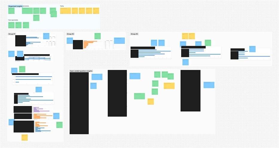
To learn how the feature’s intended user base was using the product, their pain points, and how they use it to support another user base, I built, launched, and analyzed the results of a qualitative survey using Qualtrics and Figjam. This gave valuable insight into feature prioritization and how this user group might use the new feature.

competitive intelligence and feature ideation
(Week 1.5)
Research, feature ideation, start design

Strategic insight
Rapid competitive analysis not only informed immediate design decisions but also laid the groundwork for post-launch enhancements, maximizing the value of limited research time.
Boost feature ideation and post-launch enhancements
I conducted a UX competitor/comparator analysis to boost our feature ideation and provide ideas for post-launch add-ons. These insights were shared with the team and stakeholders to create alignment and ensure we’re all on the same page in this high-speed race.
Stakeholder and team alignment
Being in constant communication with our client stakeholder was crucial for sharing insights as they were uncovered and quick alignment. This also allowed us to stay ahead of one-off requests from the stakeholder group that would’ve caused a delayed launch.

intermission (week 2)
Client off-site
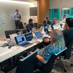
Agency life rarely rests. During this week, I needed to prep, travel, facilitate workshops, and retro for a different client, effectively eliminating any time I could work on the Mastercard project this week.
high-velocity design and prototyping
(Week 3)
Product design, rapid prototyping

Strategic insight
The prototype, tailored for leadership presentations, became a critical tool for securing project approval and demonstrating the value of strategically designed deliverables even in rapid development scenarios.
Fast-tracked decision making
Because of the quick turnaround, I had to leverage a combination of best practices, gut instinct, and quick data insights for rapid decision-making. This meant I was continuously balancing a speedy design process with strategic thinking to avoid short-sighted solutions.
Ad-hoc, collaborative design sprints
Pieces of the feature were designed in close collaboration with Phase2’s development team to ensure the design matched the functionality within the limits of the emerging technology and the scoped contract.
Strategic prototyping for leadership buy-in
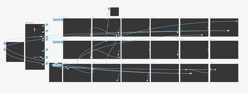
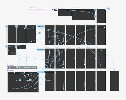
I needed to prototype strategically for leadership buy-in. High-fidelity, near-final designs in the form of a Figma prototype HAD to be ready by the deadline. Our point of contact was required to shop around a proof of concept to various high-ranking internal stakeholders to keep the project afloat and drum up excitement. This requirement led me to create a linear, story-driven, interactive prototype for both desktop and mobile, which ended up receiving approval and high remarks from Mastercard leadership.

crossing the finish line
With the prototype done and high-fives all around, it was time to celebrate by announcing the feature to the product’s 10,000+ employee group.
During an annual town hall, a video showcasing my design was put on display well before development was completed on the feature. Let’s just say people were incredibly excited!
Cool-down (11 weeks)
After the sprint to prototype was completed, I was given only two hours a week to work on small updates and tweaks as requested by Mastercard stakeholders. This generally included proposed designs for pieces that were scheduled to be included in the feature post-MVP launch and more feature ideation. The remainder of the cool-down time was for the development team to finish building the feature before internal launch.
Other than that, my work was done—the race was over.

retrospective


Justin has been absolutely fantastic to work with across the [Mastercard] workstreams and I don’t think it is a secret that he is incredibly talented. His work on [Mastercard] has been innovative, detail-oriented, and reflective of UX best practices.
Biggest challenge
Even though I knew a lot about this emerging tech, there’s a difference between reading about and interacting with it compared to building a feature around it—it required being comfortable with ambiguity, something I’ve come to learn over the years when working at speed and needing to make decisions without time or budget for research or testing.
What made this fun?
Getting to look behind the curtain and learn how to design for this new piece of technology cemented my love for designing on the cutting edge.


final thoughts
Although I can’t say anything further about this project, let’s connect and chat about how people are applying emerging tech!
What's next?


Shifting a 10-year client's view of Phase2 by authoring 3 of 4 next-gen ideas
read story
Boosting appointment bookings by 711% after unifying eight healthcare websites
read story
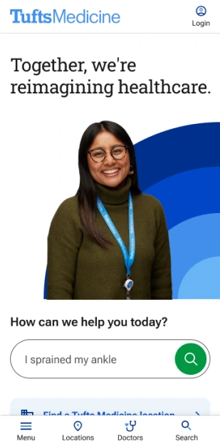

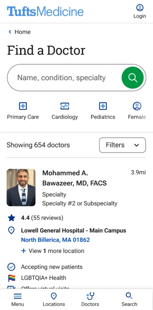

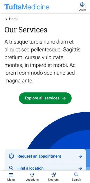

Redesigning 3,000+ doctor profiles in ~10 hours to drive a 74% boost in appointment clicks
read story


