Tufts Medicine Logo

Increasing visibility of care by merging eight websites into one

 A mobile screenshot of Tufts Medicine's homepage with the tagline Together, we're reimagining healthcare. Below the text is a smiling woman wearing glasses, a dark green sweater, and a blue Tufts Medicine lanyard. A search bar with the example text I sprained my ankle is displayed, along with navigation options at the bottom.
 A mobile screenshot of the Find a Doctor page on the Tufts Medicine website. A search bar prompts users to enter a name, condition, or specialty. Below, a doctor's profile is displayed, featuring Dr. Mohammed A. Bawazeer, MD, FACS, with a photo, rating, and hospital affiliation. Filters and navigation options are visible at the bottom.
 A mobile screenshot of Tufts Medicine's Our Services page. Placeholder text describes the services offered, and a green button labeled Explore all services is prominently featured. At the bottom, two call-to-action buttons allow users to request an appointment or find a location.

overview

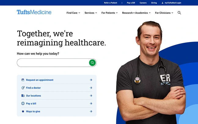
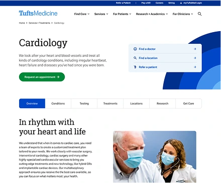
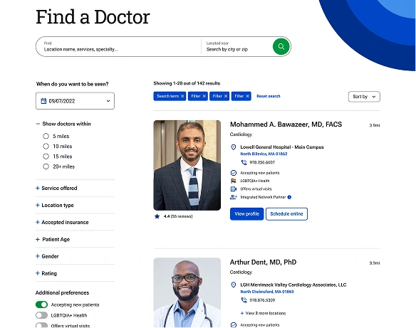
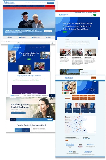
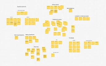
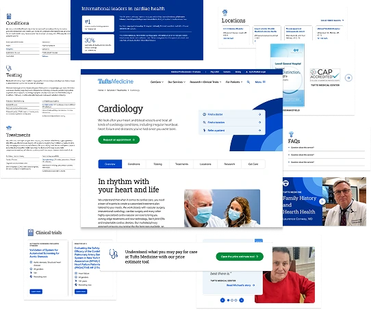
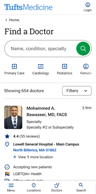
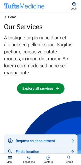
Tufts Medicine, a Boston-area leader in medical research and care, operated eight separate websites as a result of several hospital acquisitions. As you can imagine, patients couldn’t see the full extent of the system, leading to inefficiencies in accessing care.

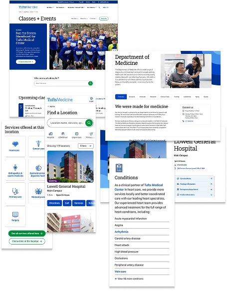
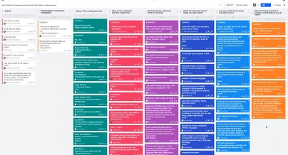
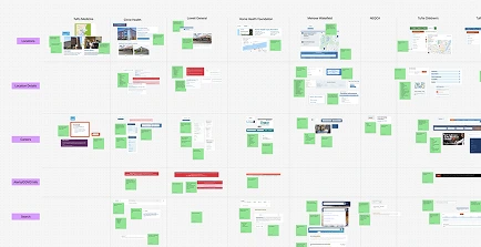
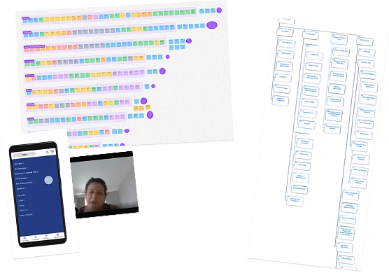
As a Senior UX Designer at Phase2 Technology, I led the UX strategy, research, and foundational product design for the first seven months of a two-year project to unify Tufts Medicine’s digital presence. Working with a team of 29, we crafted a vision and action plan for a seamless, user-centered website.

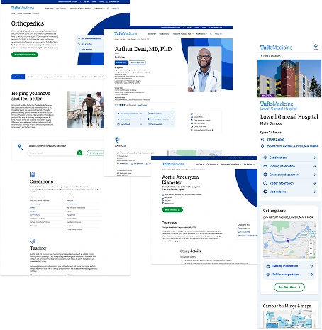
The redesign formally launched in December 2023, but work is ongoing. I’m now part of a small team implementing post-launch enhancements to further improve the patient experience. After all, a digital experience this critical deserves nothing less than continuous care.

My role

  • UX research
  • Usability Testing
  • UX strategy
  • Information architecture
  • Page layout
  • Component design
  • Interactive prototyping

Timeline

MVP discovery → handoff

Ongoing support

Team

  • Amanda Wright - Associate UX Designer
  • Joey Groh - Senior Design Lead
  • Marshall Schoenthal - Industry Principal, Healthcare
  • Sierra Alvis Robinson - Director, Content
  • Jennifer Segalini - VP, Strategy
  • Jennifer Shaal - Project Manager
  • Caroline Casals - Software Architect
  • Danielle Moore - Senior Copywriter
  • Daniel Marks - Copywriter
  • +19 more

Tools

Figma logo User Interviews logo Dovetail logo Octopus logo Optimal Workshop logo
Tufts Medicine homepage featuring the tagline “Together, we’re reimagining healthcare.” A smiling healthcare professional with a stethoscope stands beside a large search bar with action buttons below for appointments, doctors, locations, bills, and donations.
Bottom navigation bar on Tufts Medicine’s mobile site featuring icons and labels for Menu, Locations, Doctors, and Search.
Mobile view of Lowell General Hospital’s profile under Tufts Medicine, showing open hours, address, and contact info. Several quick-access buttons link to directions, emergency department, visitor info, and the hospital website.
Mobile view of Dr. Arthur Dent’s Tufts Medicine profile. It lists specialties in cardiology, clinical and academic titles, and options to call or schedule online. A photo of Dr. Dent is at the top, followed by his credentials and a 4.4-star rating.
A Tufts Medicine giving page with a section titled “Care is at the center of our mission.” Below, donation options include online giving, check-by-mail, and fundraising, with supportive images of staff and participants in a charity run.
Desktop view of Tufts Medicine’s cardiology services page. It outlines care for heart conditions and offers options to find a doctor, location, or refer a patient. The page includes tabs for treatments, testing, and other related info.
Mobile view of Lowell General Hospital’s profile under Tufts Medicine, showing open hours, address, and contact info. Several quick-access buttons link to directions, emergency department, visitor info, and the hospital website.
A mobile menu from the Tufts Medicine site with expandable categories like Find Care, Services, and For Patients. Options for referring patients, paying bills, careers, and logging into myTuftsMed are listed below.
Mobile view listing event information with icons and text. It includes timing (third Saturday monthly), format (in-person and virtual), who should enroll (patients and caregivers), and payment info (free for specific patient groups).
A mobile card for a clinical trial titled “AEROVATE EXTENSION,” studying long-term safety of AV-101 in pulmonary arterial hypertension patients. Details include conditions studied, eligibility (all genders, ages 18–75), and a “Learn more” button.
Doctor search results page on Tufts Medicine’s site showing profiles for Dr. Mohammed A. Bawazeer and Dr. Arthur Dent. Filters on the left allow users to sort by distance, specialty, insurance, and other criteria.

What is tufts medicine?

4 hospitals, 13,000+ employees, and 400,000+ patients united under a single healthcare system

Tufts Medicine, previously Wellforce, is a leading integrated health system in Massachusetts formed by the merger of four hospitals and an integrated physician network, generating $2 billion in annual revenue.

context

After six years of independent operation, Wellforce rebranded as Tufts Medicine, necessitating a unified digital presence. Their new website aimed to merge all four member groups, delivering a seamless, patient-centered experience under the 'One Tufts Medicine' brand.

The goal was to create a single, robust entry point that enhances patient access, establishing Tufts Medicine as the premier healthcare provider in Eastern Massachusetts.

We had to consolidate:

8

separate websites

100+

component types

40,000+

pages of content

A collection of screenshots from the original, pre-merger hospital websites now unified under Tufts Medicine. The designs vary in style and structure, with a mix of older layouts, visual inconsistencies, and individual branding from separate hospitals and departments. A rough pencil sketch showing a chaotic, tangled scribble connected to a clean arrow pointing right. The image represents a messy or complex process leading toward a clearer outcome or direction. A vertical collage of redesigned Tufts Medicine website screenshots. The screens showcase modern layouts with clean typography, prominent use of blue and white, and user-focused features like search tools, care navigation, doctor profiles, and service information.

impact

The new, robust website has streamlined the user journey, boosted patient satisfaction, and strengthened Tufts Medicine's online presence, marking a critical step toward unifying the Tufts Medicine brand.

While internal processes are still being aligned, the site establishes a cohesive digital presence, positioning Tufts Medicine as a leading healthcare provider and enhancing its ability to deliver integrated care.

A pencil sketch of a line graph with an upward-trending zigzag arrow, indicating growth or improvement over time. The chart features a vertical and horizontal axis with the line gradually rising toward the top right corner.

From analytics ('23 vs '24 YoY)

711%

increase in booked appointments

102%

increase in keyword rankings

418%

more donation clicks

17%

increase in doctor searches

8%

more pay-a-bill button clicks

12.4%

increase in academic and research pageviews

what the research told us

Research was critical to helping us understand the precise user problems we needed to solve and align these with the stakeholders’ priorities. I conducted comprehensive research, combining patient interviews, a UX analysis, and stakeholder interviews/workshops to gather the insights that would guide our design approach.

2

stakeholder workshops

22

stakeholder interviews

10

patient interviews and tests

100+

component variations analyzed

A virtual retro board with multiple color-coded columns and cards, each representing team reflections or feedback. The board includes categories like “What worked well” and “What could be improved,” structured to support group discussion during a UX workshop.
A digital workspace filled with clusters of yellow sticky notes, organized by theme. Topics include “Finding a doctor,” “Making appointments,” and “Why I skip checkups,” representing qualitative insights from user interviews.
A split-screen video call showing a user (left) and Justin Kalaskey (right) engaged in a remote interview. Justin sits in a well-lit room with posters on the wall, while the participant is in front of a dark wood cabinet and blue wall.
A FigJam-style board showing a UX audit of various hospital and healthcare website components. The layout includes screenshots of web pages annotated with green sticky notes, grouped by sections like navigation, search, and layout comparisons across sites.

key insights

A pencil sketch of an open eye with a round pupil and short lashes, symbolizing observation, vision, or user insight.

Bring visibility to the full spectrum of available care

Patients: Our research revealed that people needed a single, unified platform to easily find care options near home or work, ensuring access to all Tufts Medicine services.

Stakeholders: They expressed a strong desire to showcase the power of 'One Tufts Medicine’—an integrated network combining local care with academic expertise.

A simple dashed path curving toward an “X” mark, resembling a treasure map. The sketch represents a journey, discovery, or a guided user path.

Enhance patient-centric wayfinding and content

Patients: Feedback showed a desire for accessible, relevant information that directly addressed their needs, rather than content focused on medical professionals.

Stakeholders: It was essential to display a unified brand with consistent messaging while still retaining the unique personality of each hospital within the network.

A rough pencil sketch of a star-shaped award ribbon or badge with a star in the center, symbolizing achievement, recognition, or excellence.

Showcase what makes Tufts Medicine unique

Patients: They wanted to understand what makes Tufts Medicine stand apart from larger competitors and why they should choose this system for their healthcare needs.

Stakeholders: Highlighting the unique value and distinctive qualities of Tufts Medicine was crucial for engaging and retaining patients, as well as attracting top medical talent.

achieving the vision

Empowering informed healthcare choices

Patients needed a clear understanding of how their care connects across the Tufts Medicine system to make informed decisions. Collaborating with the content team, I integrated a system-wide taxonomy across location, doctor, and service pages, ensuring seamless navigation for both users and search engines.

A significant post-launch change involved reworking the doctor profile page as the original layout wasn’t as flexible as I hoped it would be:

download story (PDF)

Live version coming soon

A collage of various Tufts Medicine web pages, including sections for cardiology, clinical trials, locations, FAQs, and price estimates. The layout highlights consistent branding with a blue and white theme, user-friendly navigation, and accessible medical content.
A visual collection of user research artifacts including a screenshot of a funnel chart with colorful data blocks, a user interview video snippet, a mobile app interface, and a detailed sitemap diagram. Represents a comprehensive approach to user testing and information architecture.

Building awareness beyond clinical care

To foster advances in medicine and attract top healthcare talent, I overhauled the information architecture and navigation—twice. The site now balances patient-friendly navigation with the needs of non-patient audiences, supporting researchers, medical students, and referring clinicians. This rework strengthened the brand presence, enhancing connections with the community and satisfying the academic medical center staff.

You might be asking yourself, “Why did Justin have to do this work twice?” Here’s my answer:

coming soon

Design system with templated flexibility

For both the website’s users and its SEO strategy, having organized and structured written content was important to extend Tufts Medicine’s reach and education efforts. Leveraging the previous websites’ migrated content, I crafted templates with short-form copy components for similar pages to follow, such as services, profiles, locations, and giving. With templates and content governance in place, copywriters were able to quickly spin up the site’s 5,000+ pages with a stakeholder-aligned page structure.

Fun fact: These page templates are giving Tufts Medicine a boost in a GenAI search-powered world with content that’s well structured, organized, and tagged.

A collage showcasing different web components from the Tufts Medicine site such as doctor profiles, condition overviews, hospital location pages, and treatment detail sections. Emphasizes design consistency, mobile responsiveness, and informative content presentation.

retrospective

A small pencil sketch of two bold, textured quotation marks, slightly curved and appearing as if they were created with rough shading techniques.
Justin made my heart flutter today. He came to the table with all sorts of exciting things.
susie germer, senior director of marketing & digital strategy
tufts medicine

Biggest challenge

This was the largest project I’ve ever been on (cue Michael Scott’s “That’s what she said!”), complete with strict scopes and numerous challenges. But the biggest challenge was needing to move at a speed that would’ve made Sonic the Hedgehog dizzy. Needing to work within my limited, scoped time while producing top-tier strategies and designs meant testing only critical pieces, trusting my gut, and convincing stakeholders to take some risks with me.

What made this fun?

In a project this lengthy and intense, you need to find something to keep yourself going over the months. For me it was being able to deeply collaborate with a small group of people, figuring out how we all work together, and creating relationships and processes that carried over into future projects so we can get to high-quality faster.

What's next?

MLS Logo

Shifting organizational perceptions through visionary strategy creation

read story
A sketch of two stick-figure characters engaging in an interview. One character, wearing a jersey with the number '42,' is holding a microphone and smiling, while the other appears to be the interviewer. A soccer ball is drawn near their feet.
Mastercard Logo

Crafting a first-of-its-kind feature in a race against time

read story
A pencil sketch of a stopwatch in motion, tilted slightly to the right. The watch face shows the hand pointing near the 12 o'clock mark, with motion lines emphasizing speed.
Tufts Medicine Logo

Connecting consumers and doctors by turning broken glass into a chandelier

read story
 A screenshot of a Tufts Medicine doctor profile page featuring Dr. Arthur Dent, MD, PhD, a cardiologist. The page includes his name, pronouns, specialties, and areas of expertise, such as high and low-risk pregnancy care and laparoscopic surgery. A professional headshot of Dr. Dent, who is bald, wearing glasses, and a white coat with a stethoscope, appears on the right. The page also displays options to schedule an online appointment or call the office, along with patient reviews and additional details about his clinical roles and affiliations.

hello!

I'm Justin

get to know me
A digital bust portrait of Justin Kalaskey with a clean, white outline giving it a sticker-like effect. He is smiling slightly and wearing a plaid shirt in shades of orange, black, and white. The background has been removed, making the image stand out with a crisp, cut-out appearance.
punk rock kid