Tufts Medicine Logo

Connecting consumers and doctors by turning broken glass into a chandelier

 A screenshot of a Tufts Medicine doctor profile page featuring Dr. Arthur Dent, MD, PhD, a cardiologist. The page includes his name, pronouns, specialties, and areas of expertise, such as high and low-risk pregnancy care and laparoscopic surgery. A professional headshot of Dr. Dent, who is bald, wearing glasses, and a white coat with a stethoscope, appears on the right. The page also displays options to schedule an online appointment or call the office, along with patient reviews and additional details about his clinical roles and affiliations.

overview

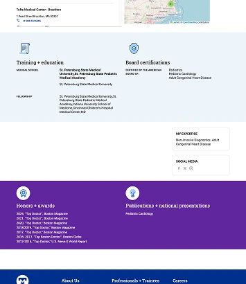
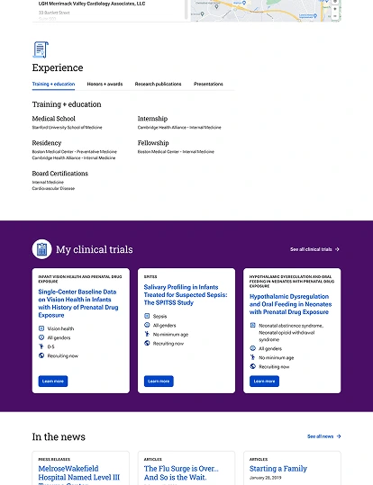
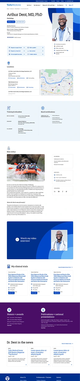
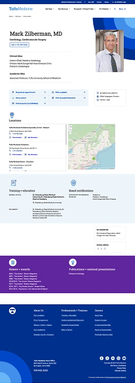
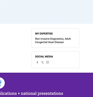
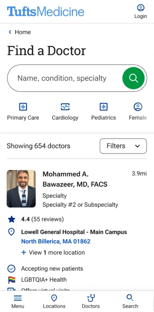
Part of the Tufts Medicine website's Find a Doctor feature is the Clinician Profile page, where clinicians can introduce themselves and start building trust with consumers. It's their space to showcase their expertise, education, and any awards/accolades they've earned.

The profile template was originally designed with flexibility in mind, as some clinicians may have significantly more to display than others. Post-launch, it became apparent the profiles were about as flexible as glass; they required significant enhancements to boost usability and help consumers get a quick insight into the clinician they're considering for their care.

My role

  • Strategy
  • Content design
  • Component design
  • Usability testing
  • Interactive prototyping

Timeline

Initial design:

Post-launch enhancement:

Team

  • Tom Belliveaue - Project Manager
  • Ofer Shaal - Software Architect
  • Alfredo Martinez Garcia - Sr. Front End Developer
  • Brent Thomas - Lead Content Strategist

Tools

Figma logo User Interviews logo Dovetail logo

context

Clinician profiles are crucial for both patients and referring clinicians. They help patients see the potential for a personal connection and referring clinicians for establishing credibility as a potential addition to their referral network.

These profiles are also a key part of the site's taxonomy, essential for AI-powered searches and helping consumers see how doctors, locations, and services are interconnected.

8

virtual, moderated usability tests

10-ish

hours to design

3,000+

clinician profiles

A previous version of a Tufts Medicine doctor profile page with segmented sections for training, certifications, expertise, social media links, and honors/awards. The design includes light blue and purple background accents for visual distinction. A rough pencil sketch showing a chaotic, tangled scribble connected to a clean arrow pointing right. The image represents a messy or complex process leading toward a clearer outcome or direction. A Tufts Medicine doctor profile page displaying sections for experience, clinical trials, and news mentions. Clinical trials are shown in a dark purple section with white cards highlighting studies, locations, and eligibility criteria.

impact

The enhancements were received positively by several audiences that view these pages. Tufts Medicine’s doctors can highlight themselves in the best light, consumers can easily identify the most important information without their eyes needing to play Pong, and referring clinicians can efficiently identify the best specialist for their patient.

A pencil sketch of a line graph with an upward-trending zigzag arrow, indicating growth or improvement over time. The chart features a vertical and horizontal axis with the line gradually rising toward the top right corner.

From analytics

74%

CTR increase on request appointment button (30 days post-launch)

13%

increase in organic page views (90 days post-launch)

1

happy Chief & Chair member (a small but critical win)

picking up the pieces

The initial design of the doctor profile page was intended to be flexible to accommodate various types of information. However, once integrated with Yext (their database), it became clear that the design wasn't adaptable enough, resulting in awkward spacing and layout issues.

These problems necessitated significant post-launch enhancements to improve usability and help consumers quickly get insights into the doctors they're considering.

how it was supposed to look

A full desktop screenshot of Dr. Mark Zilberman’s profile page. It includes his headshot, clinical and academic titles, appointment options, map with locations, training background, board certifications, and sections for honors and publications—all formatted consistently with Tufts Medicine’s branding.
The top half of Dr. Arthur Dent’s mobile profile, showing his photo, specialty, location and contact info, clinical affiliations, star ratings, and quick links for appointment actions, followed by a scrollable list of practice locations. The bottom half of Dr. Dent’s mobile profile, including the “Meet Arthur” bio with a rafting photo, social media icons, a video interview section, clinical trials carousel, awards, publications, and press mentions.

what actually happened

A full-length desktop view of Dr. Arthur Dent’s completed Tufts Medicine profile. The page includes a headshot, bio, ratings, specialties, practice locations with a map, education and certifications, personal narrative, video interview, clinical trials, honors and awards, and news mentions—all within a cohesive, accessible layout.

modular layout, meet tabs

 A Figma component showing a tabbed content UI design with labeled tabs across the top and a central placeholder box for dynamic content. The placeholder includes a purple diamond icon labeled “SWAP.”

First up, tackling those pesky layout issues.

The challenge was to display a range of information, from only a single medical school to multiple levels of training, awards, and 20+ research publications. (Also while reusing components to stay within development scope.)

Enter a secret ally: the unused tab component from the Tufts Medicine design system. Using tabs, I consolidated experience, training, honors, awards, and publications, allowing for high content variation without breaking the layout. Empty states within the tabs encouraged doctors to fill in missing info, and components like biographies, clinical trials, or news were hidden automatically if that content was not available.

Getting buy-in

To sell the idea to stakeholders, I whipped up an interactive prototype in Figma with real content, convincing them that this layout works in any situation.

same content, new layout

At the same time, I took on another side quest to resolve other layout issues and move the expertise list to the top of the profile, keeping all clinical-related content together. Clean, efficient, and just what the doctor ordered.

A profile section showing a doctor’s expertise (“Non-invasive Diagnostics, Adult Congenital Heart Disease”) and social media links for Facebook, Twitter, and Instagram. A rough pencil sketch showing an arrow pointing from the old expertise list to the new one. A cropped screenshot of Dr. Arthur Dent’s profile highlighting his name, specialty in cardiology, expertise areas, clinical titles, academic title, and a call-to-action to schedule an appointment. The profile includes a star rating summary.

New layout, new opportunities

As I neared the end, another challenge bore its head: adding ratings and reviews. This post-launch enhancement lets consumers make informed choices and build trust. It also allows consumers to see how other patients rated their care through overall and categorical breakdowns.

As a bonus, these ratings can be pulled into search engine results and AI overviews, equipping consumers with vital information before they enter the website.

A summary of patient ratings including individual category scores such as clear explanations (4.9), courtesy and respect (5.0), and time spent (4.1). A note clarifies privacy protections in review moderation.
                width= A screenshot of two patient reviews for Dr. Dent, both highly positive. Comments include praise for his attentiveness, patience, and professionalism, with dates and star ratings. A close-up of the star rating display from a Tufts Medicine profile, showing an average rating of 4.4 stars based on 55 reviews with a link to see all reviews.

retrospective

A small pencil sketch of two bold, textured quotation marks, slightly curved and appearing as if they were created with rough shading techniques.
Yeah, I mean, this page isn’t missing anything. I can see their expertise, if they’re accepting new patients... it makes it easy to know who to refer my patient to.
referring clinician
usability testing participant

Biggest challenge

After you’ve already designed something, it can sometimes be really difficult to reimagine the same thing, just better, with the same component library you had the first time. It took quite a few iterations and trial and error in Figma to finally land on something that feels like it belonged there all along.

What made this fun?

Being able to present the new solution to Tufts Medicine stakeholders after figuring out this Rubik's cube of a problem and seeing their reaction knowing they’ll stop hearing complaints from the doctors (at least about this) was worth all of the headaches along the way.

What's next?

MLS Logo

Shifting organizational perceptions through visionary strategy creation

read story
A sketch of two stick-figure characters engaging in an interview. One character, wearing a jersey with the number '42,' is holding a microphone and smiling, while the other appears to be the interviewer. A soccer ball is drawn near their feet.
Mastercard Logo

Crafting a first-of-its-kind feature in a race against time

read story
A pencil sketch of a stopwatch in motion, tilted slightly to the right. The watch face shows the hand pointing near the 12 o'clock mark, with motion lines emphasizing speed.
Tufts Medicine Logo

Increasing visibility of care by merging eight websites into one

read story
 A mobile screenshot of Tufts Medicine's homepage with the tagline Together, we're reimagining healthcare. Below the text is a smiling woman wearing glasses, a dark green sweater, and a blue Tufts Medicine lanyard. A search bar with the example text I sprained my ankle is displayed, along with navigation options at the bottom.
 A mobile screenshot of the Find a Doctor page on the Tufts Medicine website. A search bar prompts users to enter a name, condition, or specialty. Below, a doctor's profile is displayed, featuring Dr. Mohammed A. Bawazeer, MD, FACS, with a photo, rating, and hospital affiliation. Filters and navigation options are visible at the bottom.
 A mobile screenshot of Tufts Medicine's Our Services page. Placeholder text describes the services offered, and a green button labeled Explore all services is prominently featured. At the bottom, two call-to-action buttons allow users to request an appointment or find a location.

hello!

I'm Justin

get to know me
A digital bust portrait of Justin Kalaskey with a clean, white outline giving it a sticker-like effect. He is smiling slightly and wearing a plaid shirt in shades of orange, black, and white. The background has been removed, making the image stand out with a crisp, cut-out appearance.
punk rock kid