Website Redesign

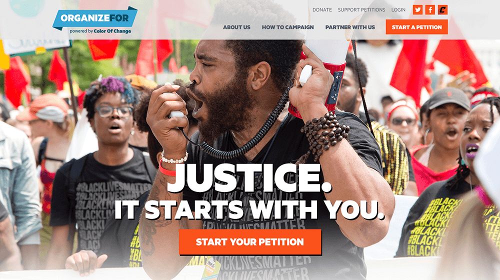
OrganizeFor, sub-brand of Color of Change, is a website that allows anyone to create a petition and gain signatures regarding issues impacting black people in America. Our main challenge was to design a website that inspired an emotional response to the injustices black communities faced while maintaining Color of Change’s brand. We also had to make it easy for users to get started and show the success that previous petitions have had.
With the use of powerful imagery, vibrant colors, and bold type, we designed a conversion-focused site that made it easy to understand how anyone can start and support a campaign.
Wireframes
Design
Reggie Snowden
Creative Director
Justin Kalaskey
UX/UI Designer
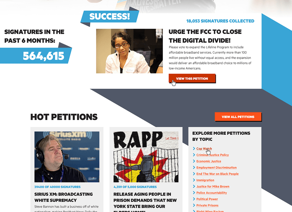

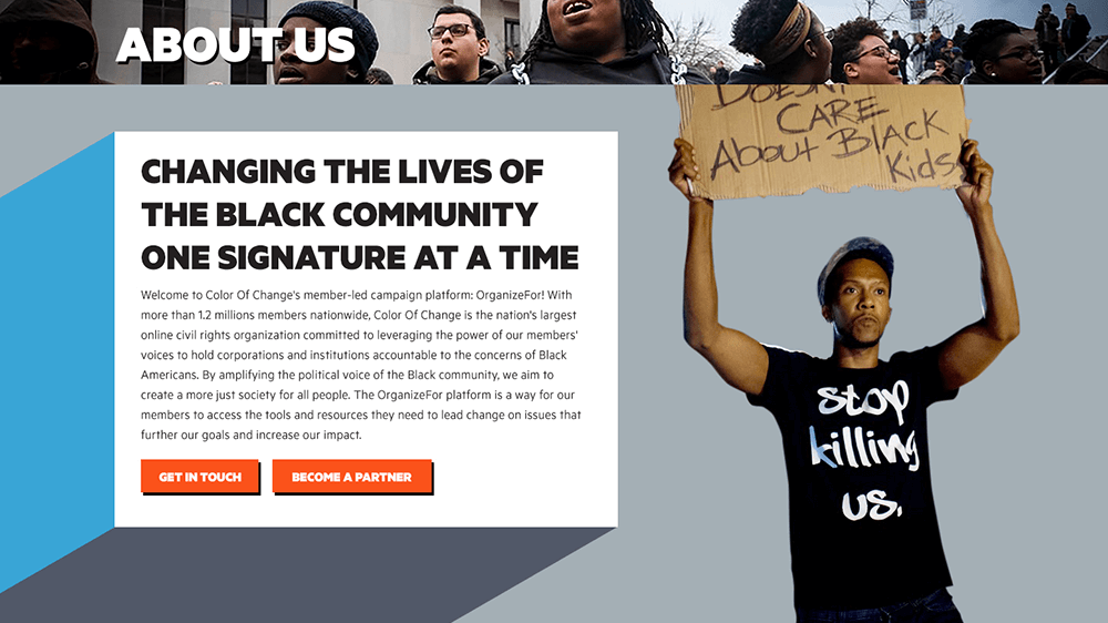
The previous website used a confusing navigation that lived below the fold. As a result, many users were unable to see anything beyond the homepage. By bringing the navigation to the header, the website is now much easier to use.
Another page that needed our attention was the Campaign How-To. We turned a wall of text and links into a step-by-step guide that makes it easy for the user to take action faster.
