Branding Guidelines
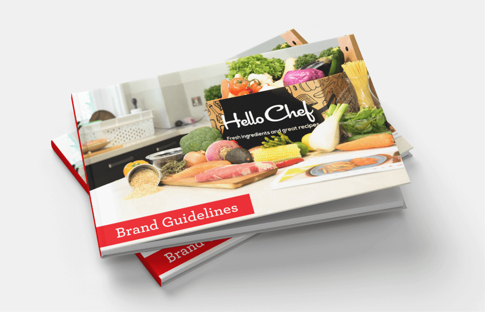
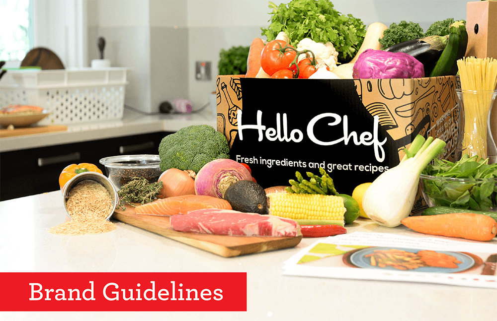
HelloChef is a meal delivery service with one big differentiator: all recipes are created by one person. While the website had some branding to begin with, it wasn’t cohesive and didn’t show the true personality of the company.
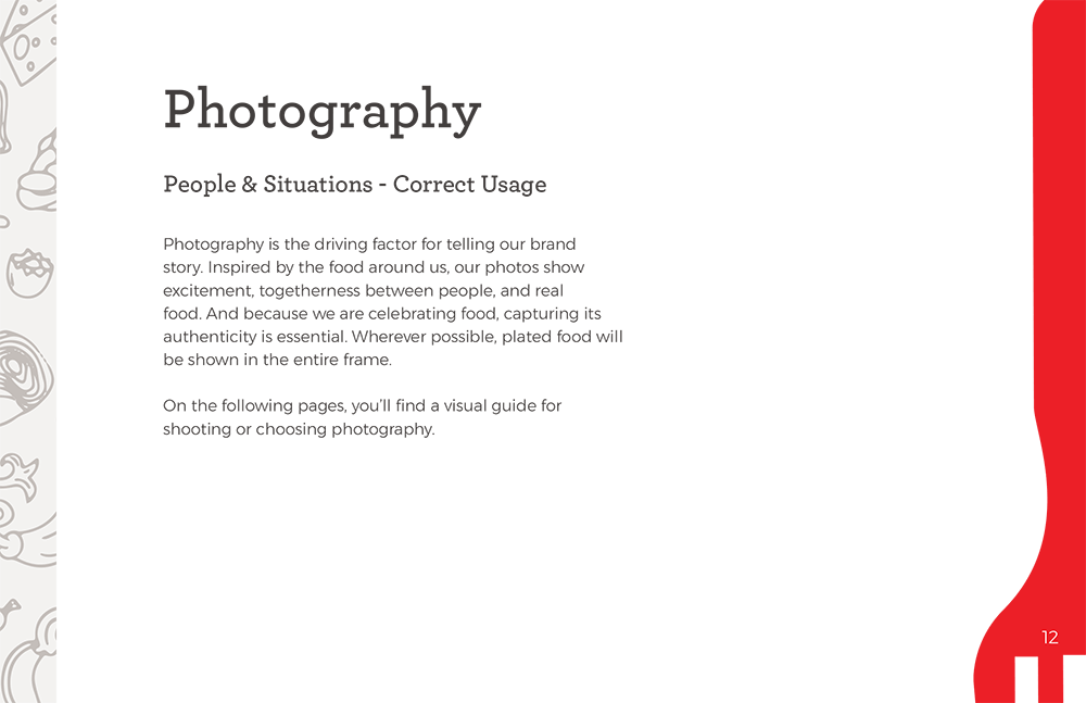
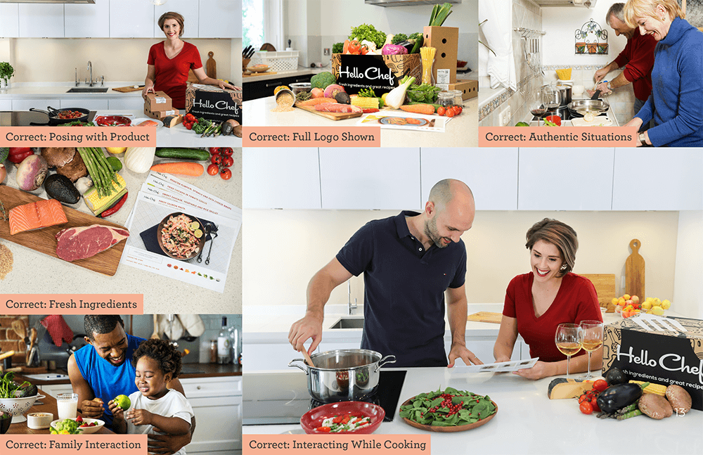
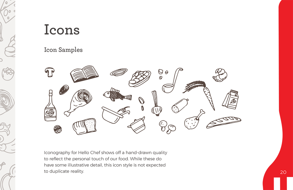
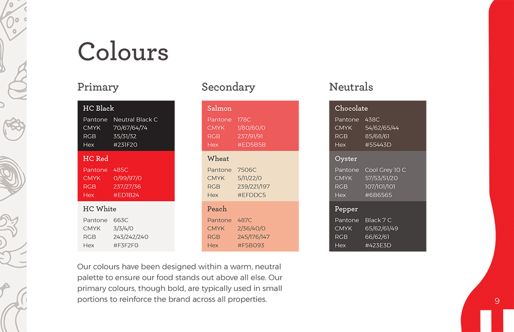
During the redesign process, I assisted in expanding upon existing brand materials like their logo and illustrations and creating new guidelines for color, fonts, and photography. We wanted to ensure the colors were inspired by food and were neutral enough so the photography could speak on its own. Fonts had to be friendly and inviting, and photography needed to showcase the food and cooking interactions. Combined with a sketch illustration style, the brand now accentuates good food and a healthy lifestyle.
Design
Branding
Bart Heird
Creative Director
Justin Kalaskey
Jess Haines
Alla Bliskovsky
Sr UX/UI Designer
Jr UX Designer
Jr Digital Designer


Ooh, Aah!
Marcom Awards (2018) - Platinum
Muse Creative Awards (2019) - Gold
HelloChef was one of the first organizations WebMechanix created brand guidelines for. As a challenge for the creative team, we spent quite a bit of time researching other brands and using this as a fully creative outlet.
After the brand guidelines were complete, we submitted them to creative award shows and won two of our first design awards: a platinum from Marcom Awards and a gold from Muse Creative Awards.
